sustainability tones
- Apr 23, 2023
- 1 min read

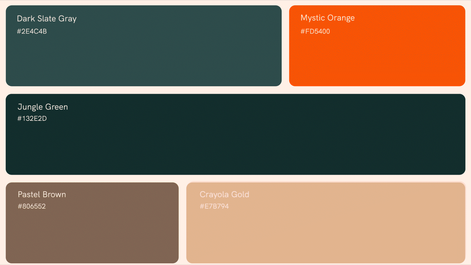
Root Global launches with a dynamic branding project, setting a new standard in the food and beverage industry's approach to sustainability. at the heart of this endeavor is the ambition to harmonize the food system's efforts towards zero emissions through a shared "carbon language." . our design concept mirrors Root Global's innovative approach, adopting dark slate gray as the primary color to symbolize growth, sustainability, and a harmonious connection with nature. accents of vibrant mystic orange are strategically used to inject a sense of urgency and creativity, highlighting the critical mission of achieving carbon-neutral food production. the typography chosen for Root Global is clean and modern, reflecting the brand’s forward-thinking and accessible approach. it presents clarity and efficiency. the branding design extends beyond color choices, incorporating nature-themed elements to underscore the ecological focus of this company.


branding_ Root Global
client_ Root Global
scope of work_ conception, ideation and creation of the brand, incl. values, strategy, ci and cd assets, web design, stationery design
project lead_ luigi bond-tropeano
Comments